
Open a design feed today and you may notice two different moods living side by side. One is polished and precise. The other looks textured, personal and a little unpredictable. That mix captures much of the conversation around graphic design in 2026: technology is moving quickly, while audiences still respond to work that feels made by people.
Trend reports from Canva and Adobe point toward expressive, sensory and culturally grounded visuals, alongside playful experimentation with AI. These are useful signals, not rules every brand needs to follow. The strongest design choice is still the one that helps your audience understand and remember you.
Here are the visual directions worth watching in 2026, plus practical ways to use them without making your brand feel like a copy of everyone else.
Perfectly aligned layouts still have their place, but many designers are bringing back details that feel touched, collected or made by hand. Think rough paper edges, visible brush marks, uneven lettering, quick sketches and photo crops that feel candid instead of staged.
The appeal is easy to understand: when so much content looks smooth and generated, a little evidence of the maker can make a design feel more personal. Canva describes this wider movement as “Imperfect by Design,” with DIY and scrapbook-inspired searches rising on its platform.
Try it: Add one handmade element to a campaign, such as a drawn underline or paper texture. Keep the message and layout clear so the detail adds warmth rather than visual noise.
Designers are paying more attention to how a graphic seems to feel, not only how it looks. Grainy paper, fabric, glass, soft shadows, metallic finishes and dimensional surfaces can make a digital image feel more sensory.
Texture works especially well in product stories, packaging mock-ups, editorial graphics and campaign artwork. It can also help a simple composition feel considered without adding more objects or copy.
Try it: Choose a texture that belongs to your story. A natural fibre may suit a craft brand; a clean glass effect may suit a technology launch. Use it sparingly behind text and check that small screens still show the message clearly.
Type is doing more than carrying information. In 2026, expect to see larger scale shifts, distinctive letterforms, playful spacing and pairings that mix editorial serifs with simpler sans-serif fonts. A headline can become the main image, especially on posters, social graphics and landing pages.
Expressive type does not mean making every line hard to read. Strong designs usually give the display type one clear job, then use calmer supporting text to keep the page accessible.
Try it: Let one headline carry the personality. Limit the number of typefaces, preserve comfortable line spacing and test your design at phone size before publishing.
AI tools make it easier to explore combinations that would be difficult to photograph or build by hand: a familiar room with an impossible object, a product in a dreamlike landscape, or a collage that shifts between real and imagined. Adobe’s 2026 forecast highlights surreal and playful creative directions, while Canva notes growing interest in uncanny and liminal aesthetics.
The tool can help you explore possibilities, but a usable campaign still needs a clear idea, thoughtful editing and consistent art direction. Unusual imagery is most effective when it supports the story rather than distracting from it.
Try it: Start with a specific concept and visual brief. Review generated results for odd details, representation issues and licensing or usage requirements before using them commercially.
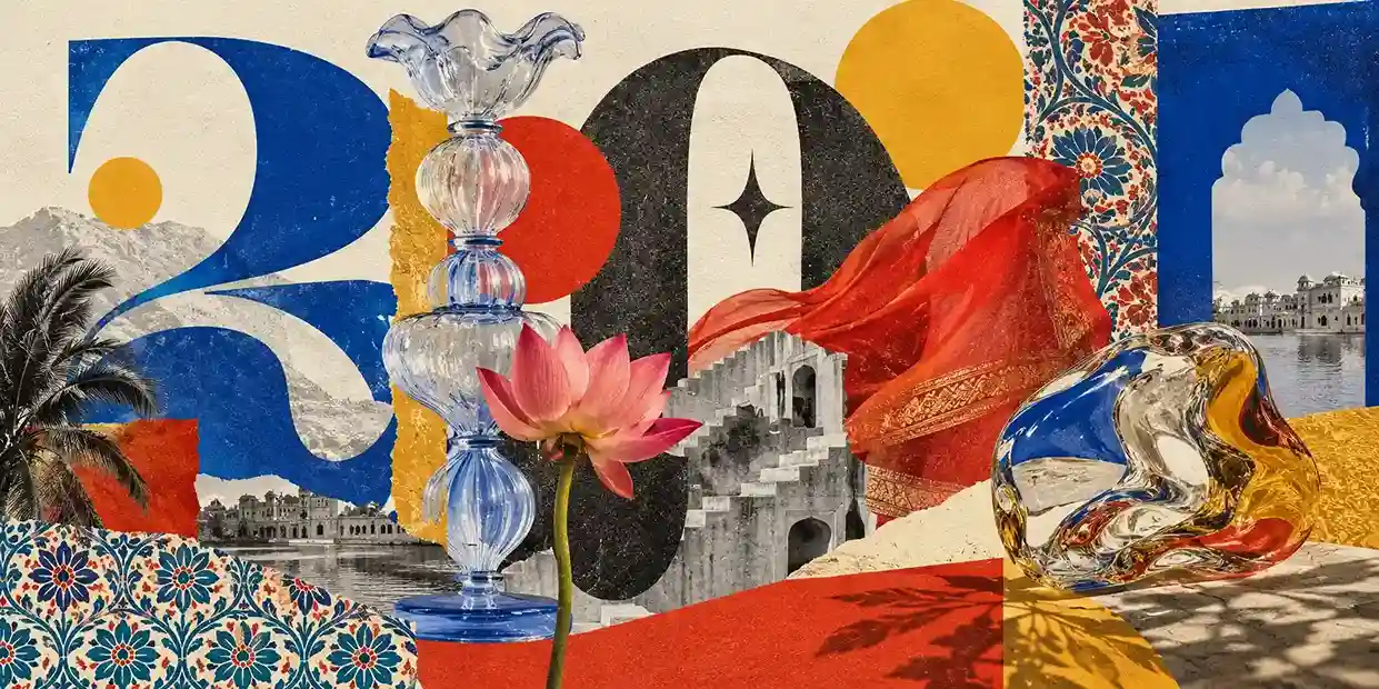
Global visual trends are easy to find, but a brand often becomes more memorable when its design reflects the people and place it serves. In India, that can mean drawing thoughtfully from regional crafts, scripts, textiles, festival palettes, architecture or cinema, rather than relying on generic motifs.
Canva’s report calls attention to heritage-led, layered visual storytelling in India. The useful lesson is not to use every traditional reference at once; it is to understand the context and work with care. Collaboration with local artists or craftspeople can make the result more grounded and respectful.
Try it: Choose one authentic reference connected to your audience or product, learn its meaning, and give it room to shine. Avoid treating cultural symbols as decoration without context.
After years of crowded feeds and constant motion, clean layouts and editorial pacing are an appealing counterpoint. Generous spacing, restrained colour, clear hierarchy and considered photography help readers slow down and focus.
This style is not the same as making everything plain. A quiet layout can still feel distinctive through thoughtful typography, one confident accent colour, or a strong image. The key is to give each element enough space to do its job.
Try it: Remove anything that does not help the reader understand or act. Use whitespace intentionally, and make sure the contrast remains strong enough for comfortable reading.
Cut-paper shapes, overlapping images, photocopy textures and bold type give layouts the lively feel of a handmade zine. This approach suits music, events, youth culture and independent brands that want to sound informal and inventive.
Because collage can become busy quickly, it helps to establish a focal point. A clear headline, a limited colour palette or a repeating grid can keep the composition lively without losing its structure.
Try it: Build a small set of reusable collage elements and rules for spacing, colour and type. That gives the work a recognisable style across different posts and campaigns.
A trend can make a campaign feel current, but it should not make your brand unrecognisable. Before adopting a look, ask whether it fits your audience, your message and the places where the design will appear.
There is no single trend that fits every industry. A strong overall direction is the blend of technology with more human, tactile and culturally specific visual choices.
AI can speed up exploration and production tasks, but people still set the brief, make judgments, refine the work and understand the audience. It is most useful as part of a thoughtful creative process.
Yes. Clean, spacious design remains useful when it supports the content and audience. In 2026 it sits alongside more expressive and textured styles rather than disappearing.
Start with one low-cost update, such as a campaign template, a new texture or a more distinctive headline style. Keep your brand colours and test the result before investing in a full rebrand.
No. Use a trend when it makes your message clearer or more memorable for your audience. A consistent identity usually serves a business better than frequent trend-led redesigns.
Graphic design in 2026 is making room for both experimentation and intention. Tactile surfaces, expressive typography, surreal imagery, local references and calmer editorial layouts each offer a different way to connect with people. None of them is a shortcut to a strong brand on its own.
Use the ideas that feel true to your audience and your story. When a design is clear, considered and recognisably yours, it can feel current without chasing every trend.